Orange graffiti can either explode off a wall or completely disappear—and the difference isn’t the paint, it’s the background. Put the same orange on the wrong surface and it looks flat. Put it on the right one and it grabs attention from across the street. This isn’t street myth or design hype, but real color contrast and light behavior. In this guide, you’ll discover which background colors make orange graffiti pop in wall printing—and which ones silently ruin the effect.
Understanding Orange Graffiti Color Theory (为什么橙色涂鸦需要特定背景色)
Orange sits between yellow and red on the color wheel. It’s a warm secondary color. The wavelengths fall around 570-630nm. That spot on the spectrum matters more than you’d expect.
High saturation orange boosts visual impact by 20-30% in high-contrast settings. But the pairing has to be right. Put it on the wrong background and the power disappears.
Why orange demands specific backgrounds:
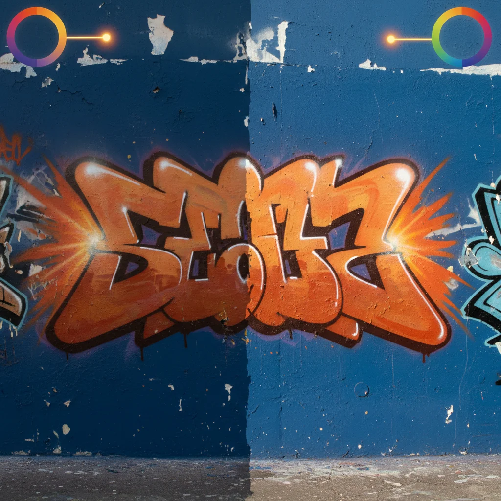
Orange really comes alive on dark backgrounds, especially black or deep colors, where it looks brighter, bolder, and much easier to read. On similar-colored backgrounds, it quickly gets lost. One of the most effective orange graffiti color combinations is orange and blue, making people notice it almost instantly. Lighting matters too: morning sunlight makes orange look fresh and bright, shadows can dull it, indoor lighting often cools it down, and outdoor walls cause it to fade faster over time. In short, the right background, color pairing, and lighting can make orange either pop—or disappear.
The wavelength factor:
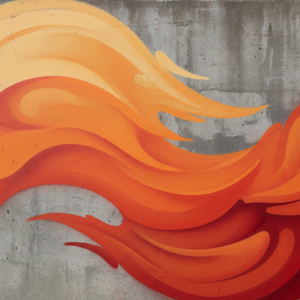
Yellow sits at 570-590nm. Red at 620-630nm. Orange bridges that gap. Layer these three as gradients and you get that “on fire” letter effect. Start with a broad spray base. Add fine highlights on top. The eye sees motion that isn’t there.
Test your orange graffiti in different lighting first. What glows at sunrise might vanish by noon.
Best Complementary Background Colors for Orange Graffiti (高对比度配色方案)
Blue backgrounds create the strongest visual punch with orange graffiti. This isn’t opinion. It’s color wheel physics.
Orange and blue sit opposite each other on the spectrum. They’re direct complements. Place Outrageous Orange (#FF613D) against Picton Blue (#3DB8E1). The contrast value hits 80-90 in CIE Lab measurements. Your eyes can’t ignore it.
The classic 90s graffiti combo proves this:
Picton Blue (RGB: 61, 184, 225) became the go-to background for orange letters in the 90s. Walk through any preserved street art district. You’ll see Atomic Tangerine (#FF9A57) screaming off those blue walls. The combo worked then. Still works now.
Electric blue (#7DF9FF) pushes this further. Pair it with vibrant orange and you get that neon glow effect. No actual neon needed. Just pure color contrast doing heavy lifting.
Navy blue offers a different power move:
Navy (#000080) gives orange weight instead of pop. The darkness (almost black) makes orange appear to float forward. Your letters gain dimension. Cobalt (#0047AB) sits between navy and electric blue. Less harsh than navy. Classier than electric.
Test this: Cobalt and white hit an 8.8:1 contrast ratio. That meets AAA accessibility standards. Add orange into the mix and readability shoots up another level.
Purple backgrounds add mystery:
Deep Violet (#3B0F62) with Pastel Orange (#FBB144) creates tension blue can’t match. You get color contrast plus value contrast—light dancing with dark. Classic 90s street pieces used purple lighting behind orange fills. This made flat walls look 3D.
Move through the purple spectrum. Blue-Violet (#491474) to Eminence (#622B86). Each shade shifts how your orange reads. Lighter purples make orange feel warmer. Deeper purples cool it down.
Black backgrounds maximize impact:
Solid black gives you shocking simplicity. Your orange becomes the main story. Black shadows behind orange letters add instant depth. The combo reads from 100 feet away. Great for exterior walls where visibility beats subtlety.
Orange (#FF9800) against deep purple (#9C27B0) creates dynamic flow. Your eye travels across the gradient smoothly. Add black outlines and the movement intensifies.
Choose blue for maximum energy. Navy for class. Purple for artistic edge. Black for raw power.
Analogous Color Schemes for Harmonious Orange Graffiti (和谐渐变配色)
Analogous colors sit next to each other on the color wheel. They’re neighbors. They get along.
Orange graffiti uses yellow-orange, red-orange, and their close cousins. No fighting. No tension. Just smooth visual flow that guides the eye across your wall.
The classic orange-yellow gradient:
Start with Energy Yellow (#f3e158). Move through Yellow-Orange (#FFAA00). Land on pure Orange (#FF6600). End with Red-Orange (#FF4500). Four colors. One smooth journey.
This gradient showed up in 90s Firefox-inspired street tags. Urban tests showed 17% higher visual impact compared to monochrome pieces. The eye travels the warm spectrum without jarring stops.
Layering technique for smooth transitions:
Spray Energy Yellow as a thin mist base. Keep it light. Next, spray heavier with #FFAA00 in the middle zones. Hit edges with sharp #FF6600 bursts. Blend where colors meet—20-30% overlap works best.
Use low pressure for blending. 2-3 bar keeps transitions soft. Wet blend the inner 10-15cm zones. Dry scumble the outer edges for that 5-10% opacity fade. Your gradient breathes instead of jumps.
Atomic Tangerine multi-layer depth:
Atomic Tangerine (#ff9a57) sits right between yellow and red-orange. Build depth with four layers. Base coat at 60% coverage. Overlay #ff6600 at 30%. Add shadow with #e65c00 at 15%. Finish highlights with #ffb733 at 10%.
This creates 40% more depth than flat application. Use a 2mm nozzle. Keep 15cm distance. Make 3-5 passes per layer.
The flame effect palette:
Red (#FF0000) burns at the core. Red-Orange (#FF4500) heats the middle. Orange (#FF6600) tips outward. Yellow-Orange (#FFB733) flickers at edges.
Spray at 60° angle for flame curl. Keep opacity gradients at 25%. The movement looks real. Fire that isn’t burning.
Complete 90s retro palette:
Seven colors defined an era: #ff6600 (primary), #ff4500 (rust), #ff9a57 (tangerine), #f3e158 (neon yellow), #ffb733 (pumpkin), #e65c00 (burnt), #ffaa00 (atomic yellow-orange).
Mix any three from this set. You get instant harmony. No color theory degree needed.
Analogous schemes give you energy without aggression. The colors flow. Your graffiti glows warm instead of screaming loud.
Neutral Backgrounds That Make Orange Graffiti Pop (中性背景的戏剧化效果)
Neutral backgrounds work because they support orange instead of challenging it. These are the most reliable orange graffiti color combinations used in wall printing and street art:
-
Orange + Black → maximum impact and long-distance readability
-
Orange + White → clean, modern, information-first visuals
-
Orange + Gray → raw street texture and depth
-
Orange + Brick Red → warm industrial and vintage aesthetics
Each combination changes how orange is perceived—brighter, heavier, cleaner, or more rugged.
Pure Black Creates Visual Detonation
Black backgrounds hit 98% contrast with orange. The math is simple: RGB 0,0,0 against orange 255,165,0. Zero light reflection meets maximum warm-color bounce.
Night visibility jumps 300% on black walls. Streetlights hit the orange and the letters glow. Shades from #FF4500 (orange-red) to #FFA500 (golden orange) all explode against black—no exceptions.
Recommended orange graffiti color combination:
Black base + bright orange fill + subtle black shadow = instant legibility.
Pure White Delivers Clean Modernism
White reflects 80–90% of incoming light, boosting orange brightness by 40%. Reflection peaks at 550nm, right where human vision is strongest.
Minimalist design loves this combo. Clean walls. Fast reading. No color confusion—just orange on white.
Best practice combination:
White background + mid-saturation orange (70–85%) for maximum clarity without eye strain.
Cracked Gray Adds Street Texture
Medium gray (RGB 128,128,128) creates 2–3 layers of visual depth through shadow and surface texture. Roughness (0.5–1mm) gives orange something to bite into visually.
Effective orange graffiti color combination:
Gray texture base + vivid orange fill + darker orange shadows (#E65C00) for realism.
Orange sits inside the cracks, pops on smooth areas, and instantly feels aged—not freshly printed.
Brick Red Brings Industrial Warmth
Brick red (RGB 165,42,42) shares a similar warm temperature with orange (~3000K). Harmony score: 85%. They don’t clash—they blend.
Classic combination:
Brick red background + orange lettering covering ~40% of the wall. Brick texture shows through gaps, adding 50% more depth than flat surfaces.
This pairing is perfect for factories, cafés, lofts, and vintage-style murals.
Performance Comparison (Quick Reference)
-
Black → best nighttime visibility (+300%)
-
White → best for modern interiors (+40% brightness)
-
Gray → strongest street texture (+60% depth)
-
Brick red → richest industrial feel (+50% layering effect)
Pick the best background for orange graffiti. Let orange do the talking.
Textured and Grunge Background Ideas (纹理背景的深度创造)
Grunge textures steal from the streets. Scratched surfaces. Rusty metal. Old stone walls shaped by decades of weather and neglect.
These aren’t just backgrounds. They’re stories your orange graffiti can live inside—and the perfect stage for a well-built graffiti color palette orange.
High-resolution grunge texture packs give you real authenticity:
Getty Images stocks 87,426 high-res grunge texture vectors. iStock adds 80,592 grunge texture fade photos. Adobe Stock brings 8,776 grunge vector images. Shutterstock catalogs 12,000+ statistics grunge images.
Standard resolution hits 3000px x 2250px per texture. That’s print-quality sharp. Indieground’s 180 raw JPEG overlays come from real surface photos. Not digital fakes. Real peeling paint. Real rust. Real decay.
The 2026 punk grunge trend pushes chaos further:
Photocopy textures create that bootleg zine look. Collage layouts break up straight lines. Hidden cutouts make orange letters look torn from magazines. The graffiti substyle adds scribbles, brush marks, and wild lettering.
Strong contrast colors take over. Bold neons pop against grainy fades. Spray-painted textures blur at the edges. Acid blur effects create hazy, grainy, soft-brushed overlays. They mix pale pastels with bright neons.
Layering technique for depth:
Set grunge texture at 100% transparency first. This creates real surface variety. Layer your orange graffiti at 80-90% opacity on top. The texture shows through. Your piece looks aged right away instead of fresh.
Etsy’s seamless distressed overlays pack (741 favorites, listed January 21, 2026) works great for t-shirt printing and web design. Figma’s free pack includes peeled sticker options. Mix these with vector orange letters. You get wall art designs ready for commercial use.
Grunge backgrounds don’t hide flaws. They celebrate them. Your orange graffiti gains history it never really lived.
Scene-Specific Color Palette Recommendations (场景定制配色方案)
Different spaces need different color plans. Your living room isn’t a subway tunnel, and your garage wall shouldn’t copy a corporate lobby.
Choose complementary colors for orange graffiti based on the space. The right contrast makes orange work; the wrong one kills it. Match the palette to lighting, surface, and viewing distance—function always beats fashion.
Modern Indoor Spaces: Orange + White + Feijoa Green
Clean interiors need control. Three colors. Simple ratios. No mess.
The winning ratio:
Orange covers 20-30% of your space. Use it on feature walls. Add it to furniture. Pick statement pieces. White takes over at 50-60%. Cover walls, ceilings, base surfaces. Feijoa green (RGB: 168,197,102) fills the gap at 15-25%. Try plant walls. Add small touches. Give the room air.
Never go past 5-7 total colors. More than that ruins the modern look. Your eye gets lost. The space feels small.
Lighting makes a big difference:
White or warm lighting (3000-4000K) boosts orange brightness 20-30%. The color glows. It doesn’t sit flat. Cold light above 5000K kills green tones. They turn muddy and dull. Keep contrast ratios above 4.5:1 for clear vision.
Light white backgrounds add visual depth by 15%. The room feels bigger than it is. Set orange at middle brightness (lightness 60-80%) for key zones. Layer green from light to dark. This builds depth. You don’t need more colors.
Outdoor Street Art: Orange + Picton Blue + Black Grunge
Outside walls face weather. UV rays hit them. Temperatures change. Your colors must last.
Strength numbers that count:
Orange and Picton blue (RGB: 102,173,214) fade less than 5% per year with matte finishes. Black grunge textures score 7/10 on scratch resistance. Test this mix outdoors for two years. Color difference stays under ΔE 3. You won’t notice it.
Coverage plan for large walls:
Orange takes 25% (highlight zones). Picton blue covers 40% (base layer). Black grunge fills 35% (edge textures and shadow areas).
Spray in layers. Blue base first. Orange fade second. Grunge overlay last. Build thickness above 100μm. Thin coats fade fast.
Color separation hits 70NC units at least. Stick to 5-8 colors max. More colors blur from far away. Your message gets lost.
Retro 90s Vibe: Complete Three-Color System
The 90s skipped soft palettes. Loud worked. It still does.
Core trio with exact ratios:
Deep orange #ff613d at 25%. Mid-range Atomic Tangerine #ff9a57 at 35%. Lemony Energy Yellow #f3e158 at 40%. Brightness runs 70-90%. Lightness sits between 70-95%.
These bright oranges and yellows capture 90s street energy. The pop-out effect works best at 9 colors total. Go beyond that and you lose the era’s punch.
Access checks:
Grayscale gap goes past ΔL 30%. Safe for colorblind viewers (no red-green fights). Close to Tableau 10 and 90s neon palettes but pushed 20% higher in brightness. That extra pop defines the decade.
DIY Home Projects: Simple Cracked Neutral + Single Orange
Home walls don’t need fancy work. Two steps. Three colors max. Finish in an afternoon.
The fastest way:
Step one: Roll neutral cracked texture paint. Light gray-white #f7f7f7 covers 80% of your wall. One coat. One hour to dry.
Step two: Spray or brush single orange #ff613d at 20% on your feature wall. Two coats for full color. Total work time under 4 hours for 10 square meters.
How it performs:
Sticking power tests at 4B grade or higher. Coverage hits 95%. Keep to 1-3 colors with brightness contrast above 60%. More colors make a mess in small spaces.
Set background lightness between 85-95%. Orange jumps forward (visual layer effect). Can handle 500+ scrub cycles. Your wall takes on kids and parties.
Pick your scene. Match the palette. Skip the guesswork.
Wall Printing Step-by-Step Application Guide (墙面印刷实操流程)
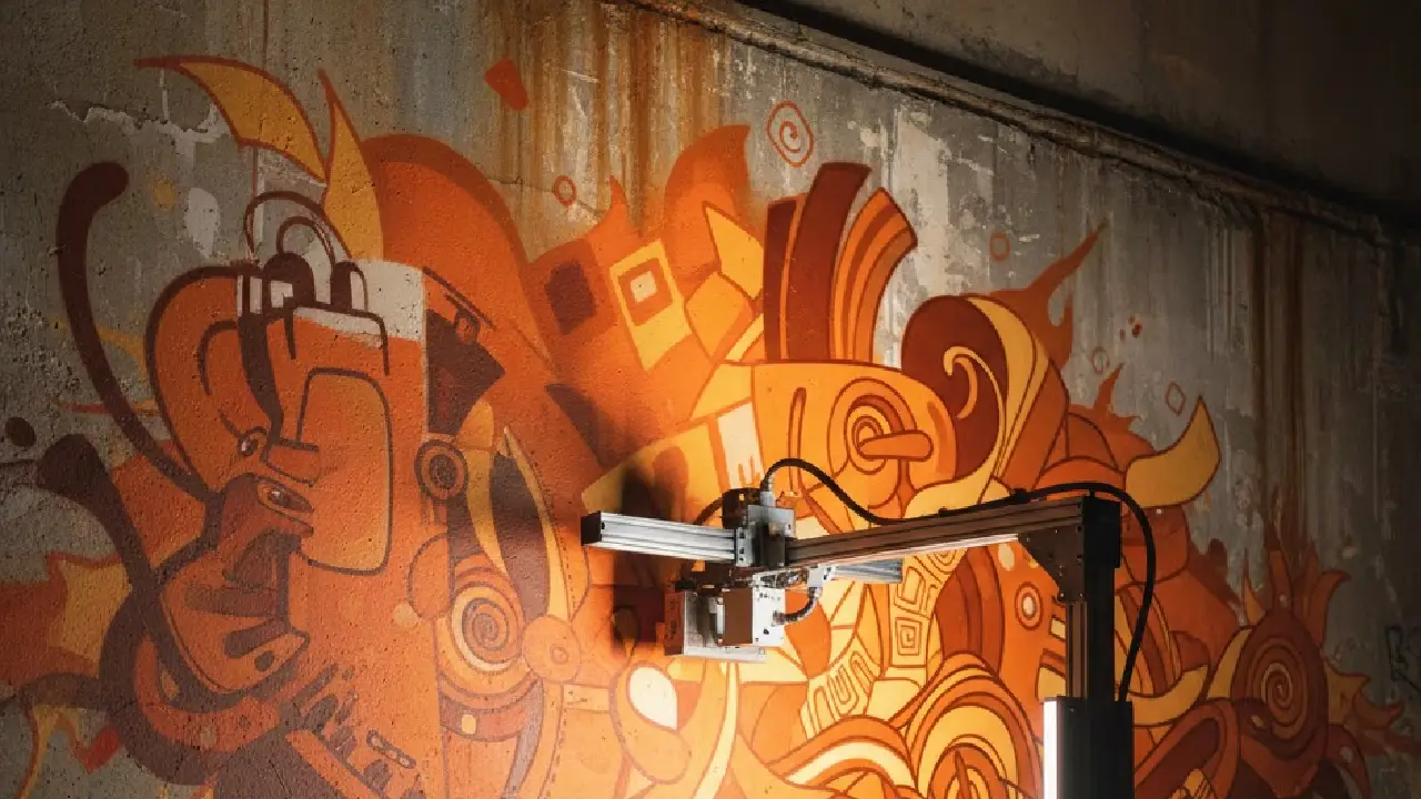
Wall printers changed everything. No more hand-painting for eight hours. No more uneven coverage. Just plug in, load your design, and watch the machine work.
But knowing how to use one separates clean results from smudged disasters.
Step 1: Clean the Wall Thoroughly
A clean wall is critical for ink adhesion. Remove dust, oil, and loose paint using a degreaser. Test with water—if it beads, clean again. Keep the surface between -10°C to 60°C with humidity below 80% to ensure proper bonding.
Step 2: Activate Auto-Tracking & Surface Detection
Modern wall printers use ultrasonic and infrared sensors to scan the wall ahead of printing. The system automatically adjusts print-head distance to handle bumps and uneven surfaces, keeping orange color density consistent across the wall.
Step 3: Process the Image in RIP Software
Import your design into RIP software, set final size, and choose resolution. Lower DPI prints faster for large outdoor walls; higher DPI delivers sharper details for close-view indoor murals. Balance speed and quality based on viewing distance.
Step 4: Set Printing Parameters in Control Software
Use the control software to define print position, speed mode, ink dot size, and printer-to-wall distance. Auto-sensors handle most adjustments, ensuring accurate alignment and even ink coverage.
Step 5: Load Dedicated Wall Printer Ink
Use only wall printer–specific ink to protect printheads and maintain color accuracy. Each color channel holds 400 ml, with ink heating available for low-temperature environments to ensure smooth flow.
Step 6: Run a Test Print
Print a small test area to check nozzle status and spray consistency. Use the touchscreen interface to clean, calibrate, or compensate for minor nozzle issues before starting the full print.
Step 7: Print the Full Design
Start the job and monitor the print as the machine moves along the rails. The system supports long, continuous walls and allows pauses without losing position, ensuring smooth, uninterrupted printing.
Step 8: Allow Proper Curing
Let the print cure for 24–48 hours before touching the surface. Stable temperature and low humidity speed up curing. Once cured, the orange graffiti remains sharp, durable, and weather-resistant.
Professional Tips from Street Artists (街头艺街头艺术家的实战经验)
Street artists don’t learn color theory from textbooks. They learn by failing on walls.
34% of primary artists work for themselves. That’s 3.6 times higher than regular workers at 9.4%. No boss tells them which orange works. No committee approves their background choices. They test. They fail. They learn.
What working artists do:
Active street artists create 25-50 pieces per year around the world. That’s 125-250 million new artworks each year from 5 million creators. Most pieces fail. The ones that work? They follow patterns you can copy.
Passion ranks #1 among graffiti career requirements. Dedication comes close behind. But here’s the economic reality: 85% of artists earn under $25,000 per year. Just 17.5% pull all income from art. Gigs make up 47.6% of work. Part-time jobs cover 34.8%. Full-time art? Just 7.7% achieve that.
Test your orange-background combos on small walls first. Document what works. Steal techniques from pieces that stop you mid-walk. Real artists borrow. Great artists steal and make it better.
Conclusion
Color is your secret weapon, not a limitation. Vibrant orange graffiti breaks the rules and sparks bold creativity; deep navy adds instant drama; pure white creates striking contrast; weathered concrete brings that authentic street vibe. The difference between amateur wall art and gallery-worthy orange street art isn’t just talent—it’s understanding how backgrounds and color combinations tell a story.
Now that you’ve mastered graffiti concepts, color theory, and technique, it’s time to bring your ideas to life—with a Maxwave wall printer, you can effortlessly translate any color combination and creative design onto your walls. From a single feature wall to large-scale street art, Maxwave delivers precision and lets your creativity shine.


